
Our goal
For a period of 16 weeks, our team embarked on a mission to design an innovative application aimed at combating obesity in America.
Our goal was to empower individuals who are at risk of obesity to make healthier food choices and adopt a healthier lifestyle.
The result of our efforts was a user-friendly application that provides users with the tools and support they need to achieve their health and wellness goals
Problem Background

Overview of Related Work
Our team examined three related products to gather insights and determine the range of features available in the market.
By evaluating the features of each product, our team was able to gain a comprehensive understanding of the current landscape
and make informed decisions about the direction of our own product.
• Slip Buddy
• Fitness Builder
• Fooducate

Overview of Related Work
Findings
• Existing apps take time to begin understanding eating habits, while we would like to encourage at-risk individuals to develop healthy eating
patterns from the first interaction with our product.
• Exercise is an important aspect of dieting, but without combining nutrition and exercise into one seamless experience, users will have these
two connected parts of our lives siloed.
• Finding foods in a database and determining serving size is very complicated for a user. They will often get confused and frustrated with
the experience.
Overview Of Target Audience
Our target audience is the busy, working-age population between the ages of forty and sixty who are balancing work and family responsibilities.
These individuals often find it difficult to prioritize their own health and wellness, due to their demanding schedules
Interviews
Take Aways from Interviews
People do not want to spend a lot of time worrying or working to fix their health problems.
• People will spend money, but time is a valuable asset to our users, and they have other activities they would like to engage in during free time.
Our users need solutions that are fast and nonintrusive or else they will become annoyed.
Our representative users engage more when guided by experts or informed opinions.
• Our users need to be guided to improve their health. When their own opinions and assumptions take over, they feel unsure of themselves and are
unlikely to continue using a good solution.
Products that felt clinical and related to orders from a doctor felt scary to the user and were avoided and ignored.
• While health behavior improvement products are very serious, users do not want to feel that seriousness. They want to feel like they are in control
and what they are doing is fun and enjoyable
Consolidated Features
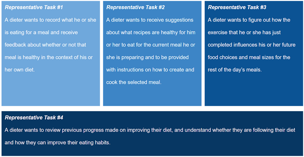
• A way to identify and record the particular food a user is eating during a meal and the information about that food such as
calories, serving size, and nutritional information.
• A way to universally communicate to users how well they have followed their diet and exercise requirements for a day.
• A way to look back at a previous day’s food intake and exercise along with the information about that food and exercise.
• A way to record exercise completed during a day, including cardio exercise, step counts, and weight lifting.
• A way to find recipes that are healthy for that person and fit the style of a current meal
Usability Testing Paper Prototype

Observations
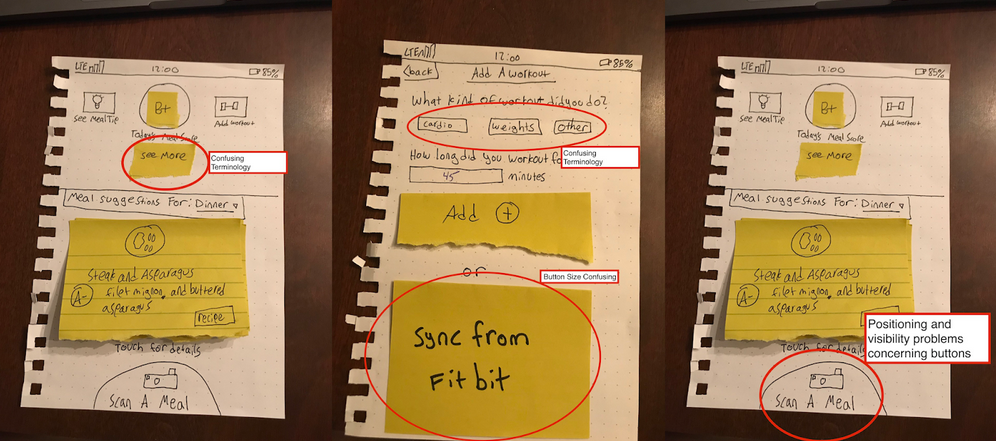
During our usability testing, we identified a few potential usability issues. Firstly, some users were not aware that the meal
suggestion cards on the homepage were buttons leading to more information about the recipes (as seen in Figure 1). Despite eventually realizing that these were links,
the absence of identifying elements as buttons caused confusion among some users. In addition, when users entered the exercise page, they were uncertain whether they
should press the sync with Fitbit button (as seen in Figure 2). The button's bright color and prominent position led some users to believe that they had to press it
instead of simply filling out the form, leading to unnecessary clicks. Despite these two issues, the majority of users were able to navigate the prototype easily and
with success. They were thrilled with the experience, and many took the time to ask us about the development process and concept behind the prototype. Overall,
the users' experience was greatly improved compared to their experiences with similar products from our initial interviews.

Findings from prototype
• Button Size - Define button sizes with purpose and importance.
• Confusing Terminology - Our target audience should understand the terminology.
• Placement of UI Elements - Make the user see the important features.
• Feature Overload - Only show what is necessary to the user.
Resolutions
Our group learned that designing interfaces with clear visibility and perceived affordances is crucial for a seamless user experience. The main problems
we observed regarding button identification prompted us to continue developing better interfaces that clearly convey which elements are buttons. In future iterations
of our prototype, we may add "Learn More" buttons or other cues to help users understand what elements are buttons. For the Fitbit button, we could add text to explain
when to use it or consider repositioning the button in a less intrusive location for users who won't be interacting with it. While our app conveys a strong sense of
available affordances to the user, these observations have given us insight into areas where we can still improve our prototype.
Final Prototype
Eager to bring creativity to the social product world.
Let's connect!